A one pager for a nutrition advisordesigned for clarity and flow,guiding users to take actionwith confidence and ease.
Project type: One-pager website and brand identity
Role: UX\UI designer and brand designer.
Industry: Fitness and nutrition
Tools: Elementor, Figma, Figmjam and Adobe ilustrator.
Key Features:
Clear one-pager layout built for fast, goal-oriented browsing.
Mobile-first design with responsive structure and smooth flow.
Service breakdowns designed for clarity and fast comprehension.
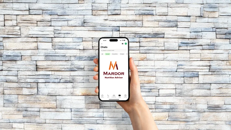
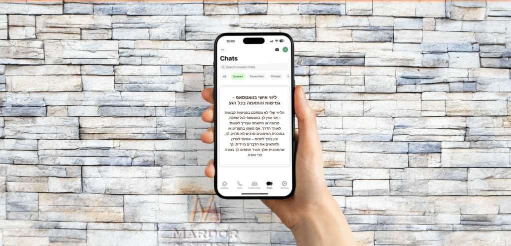
Embedded WhatsApp call-to-action for instant contact.
People looking for a reliable, personal nutrition expert they can connect with easily.
Users who want fast, mobile-friendly access to service info and real-life results.
Visitors who value trust, clarity, and a straightforward user experience.
Difficulty in organizing tasks and sticking to schedules.
Lack of access to expert advice or structured workflows.
Overwhelmed by large goals without clear, actionable steps.
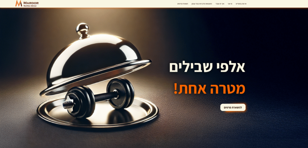
The Mardor Nutrition site was built as a high-conversion one-pager, focusing on clarity, trust, and mobile-first access.
Sections were ordered to match how users think:from understanding what Oren offers, to seeing results, and finally reaching out.
Design choices emphasized white space, bold headings, and simplified actions — making every scroll feel purposeful.
A consistent visual language ties together brand identity and function, creating a seamless experience across devices.
Age: 26 years old.
Occupation: Marketing manager at a tech startup.
Goal: Gain muscle mass through a structured fitness and nutrition plan.
Pain Points: Feels overwhelmed by conflicting advice, struggles to eat enough and stay consistent with workouts.
Needs: Clear guidance, a plan tailored to his body type and lifestyle, and regular accountability to stay on track.
Daniel lands on the Mardor Nutrition homepage through an Instagram ad.
He’s frustrated with trying different bulking methods with no consistent results.
The bold messaging and clear visuals immediately position Mardor as a focused and reliable guide.
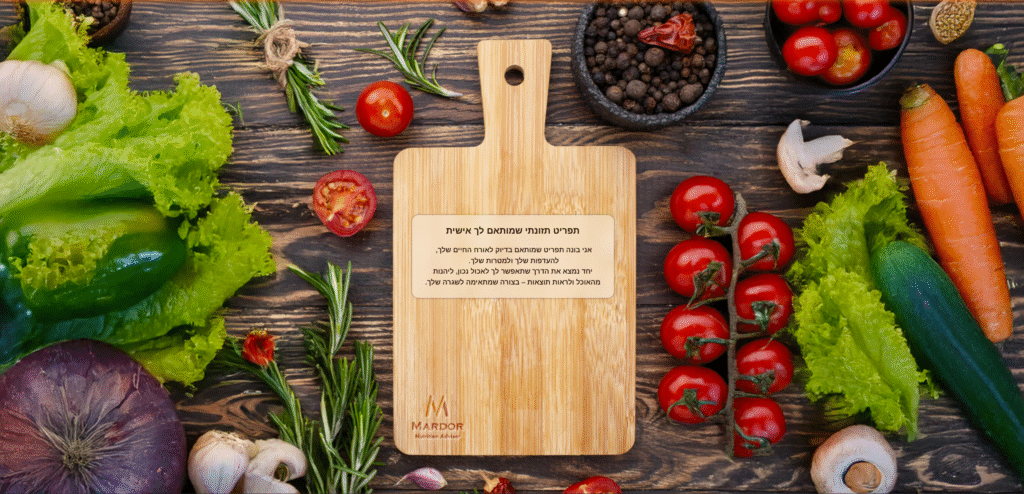
He explores the “What’s in the Menu” section on the website.
Daniel feels most programs are too generic and don’t account for his lifestyle or eating habits.
The promise of personalized meal and training plans tailored to his goals builds trust.
Daniel reads testimonials and checks the biweekly tracking and WhatsApp support.
He worries about staying committed without proper structure.
Seeing others succeed with ongoing support gives him confidence to take the next step.
Daniel submits the contact form and quickly receives a friendly response from Oren.
He’s nervous about wasting more time on something that won’t work.
The direct, personal follow-up makes him feel like this time, he’s not doing it alone.
Tagline: “Many roads. One goal.”
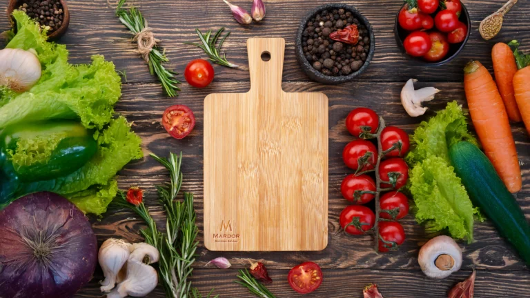
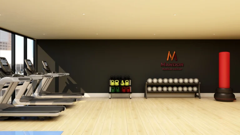
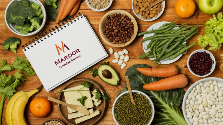
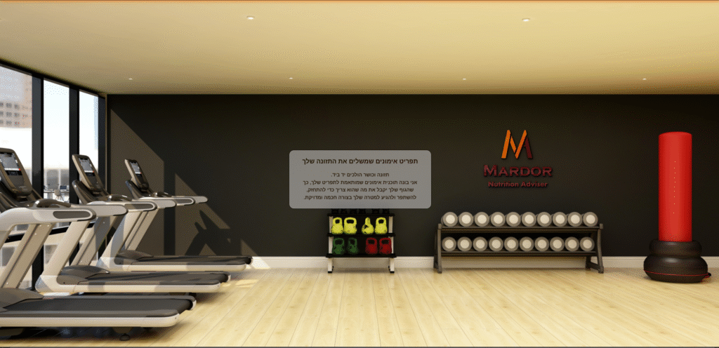
Background photo with a hint of both nutrition and training
‘Contact us’ button
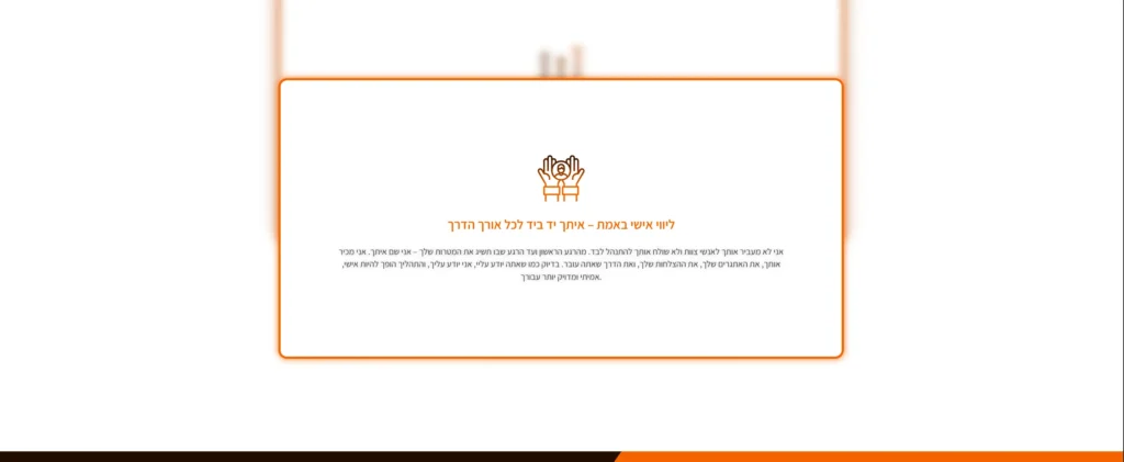
3 service cards (Nutrition Plan, Training Program, WhatsApp Guidance)
Short descriptions
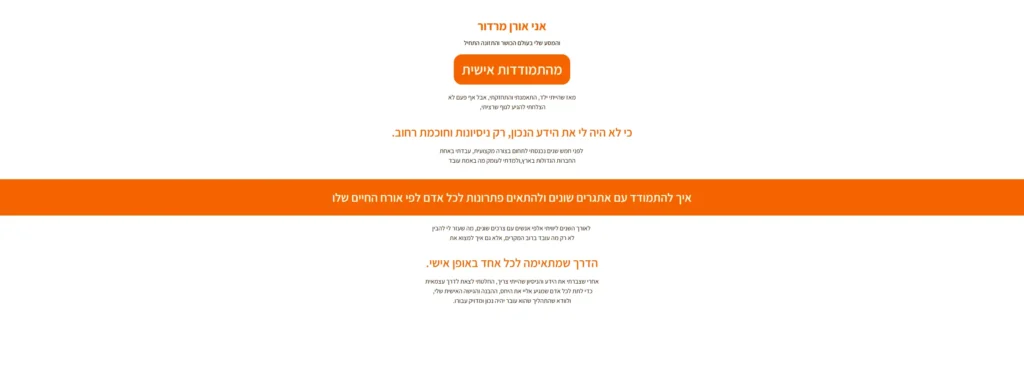
Text block: Short story
Embedded video of Oren speaking
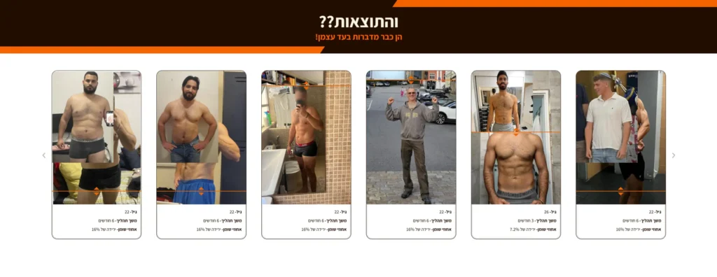
Before/after photos
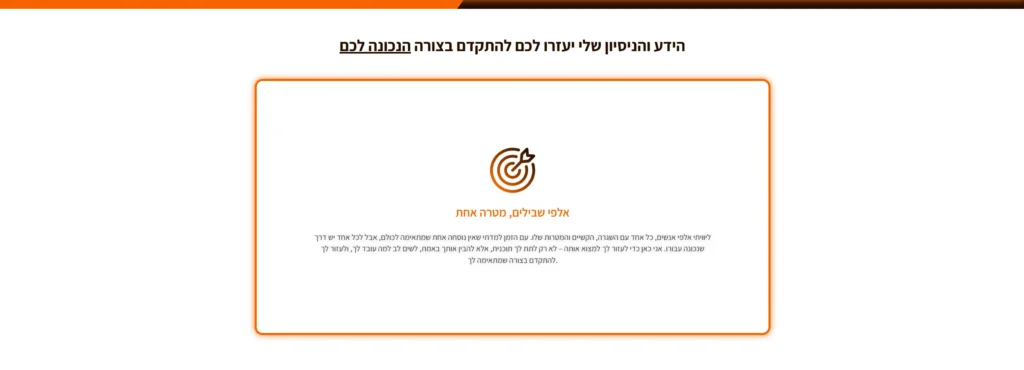
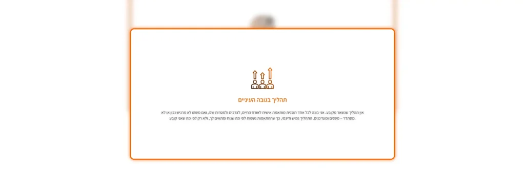
Process overview
Reinforces success and trust
Website
Assistant
Medium-Bold
PX- 8 12 16 24 32
Logo
Copperplate Gothic
Bold
Aharoni
HEX64040C
RGB100, 4, 12
CMYK0%, 96%, 88%, 61%
HEXf25205
RGB243, 83, 4
CMYK0%, 66%, 98%, 5%
HEXF9F6E4
RGB249, 246, 228
CMYK0%, 1%, 8%, 2%